
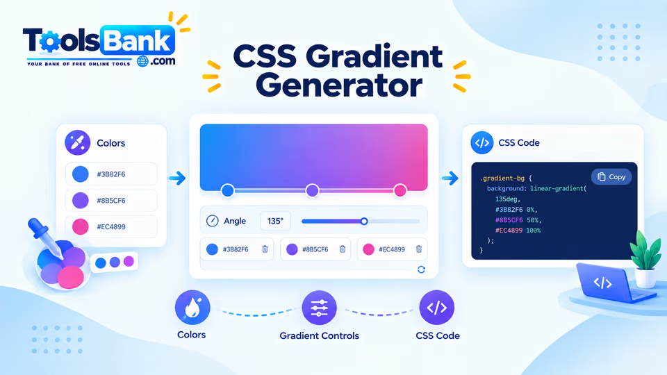
Here are 12 CSS gradients for jobs that come up in almost every project: backgrounds, buttons, headings, borders, image overlays and simple charts. Each one has the code and a note on when it works best. To build your own from scratch, use the Gradient Generator.
1. Soft page background
A light, almost invisible gradient makes a plain page feel finished without distracting from the content.
body {
  background: linear-gradient(180deg, #f8fafc 0%, #eef2ff 100%);
}
2. Bold hero section
Three shades of the same hue give depth without clashing.
.hero {
  background: linear-gradient(135deg, #1e3a8a 0%, #2563eb 50%, #38bdf8 100%);
  color: #fff;
}
3. Button that shifts on hover
You can't transition between two gradients directly, but you can make the background twice as wide and slide it.
.btn {
  background: linear-gradient(90deg, #2563eb, #7c3aed, #2563eb);
  background-size: 200% 100%;
  transition: background-position 0.3s ease;
}
.btn:hover {
  background-position: 100% 0;
}
4. Gradient text
Good for one headline or a logo word. Don't use it for body text, because it's harder to read.
.headline {
  background: linear-gradient(90deg, #f97316, #db2777);
  -webkit-background-clip: text;
  background-clip: text;
  color: transparent;
}
5. Dark overlay so text stays readable on a photo
The gradient fades from dark at the bottom to clear at 60%, so the photo still shows at the top.
.card-image {
  background-image:
    linear-gradient(to top, rgba(0, 0, 0, 0.7), rgba(0, 0, 0, 0) 60%),
    url("photo.jpg");
  background-size: cover;
}
6. Gradient border with rounded corners
border-image doesn't work with border-radius, so use two background layers instead.
.card {
  border: 2px solid transparent;
  border-radius: 12px;
  background:
    linear-gradient(#fff, #fff) padding-box,
    linear-gradient(135deg, #2563eb, #db2777) border-box;
}
7. Spotlight glow on a dark background
A soft radial glow in one corner adds depth to dark landing pages.
.dark-section {
  background:
    radial-gradient(circle at 30% 20%, rgba(99, 102, 241, 0.35), transparent 40%),
    #0f172a;
}
8. Progress bar with a hard stop
Putting two colour stops at the same position creates a sharp edge instead of a fade. Change 65% to any value.
.progress {
  height: 10px;
  border-radius: 999px;
  background: linear-gradient(90deg, #22c55e 0 65%, #e5e7eb 65% 100%);
}
9. Diagonal stripes
Useful for "under construction" areas, disabled states or a subtle pattern.
.stripes {
  background: repeating-linear-gradient(
    45deg,
    #fde68a 0 10px,
    #fef3c7 10px 20px
  );
}
10. Pie chart with no images or JavaScript
Each slice is a hard-stop range on a conic gradient.
.pie {
  width: 160px;
  aspect-ratio: 1;
  border-radius: 50%;
  background: conic-gradient(
    #2563eb 0 40%,
    #f59e0b 40% 70%,
    #10b981 70% 100%
  );
}
11. Colour wheel
A full rainbow around a circle. Repeat the first colour at the end so the seam is smooth.
.wheel {
  width: 160px;
  aspect-ratio: 1;
  border-radius: 50%;
  background: conic-gradient(red, yellow, lime, aqua, blue, magenta, red);
}
12. Soft "mesh" background
Several faint radial gradients layered on white give the blurry, multi-colour look you see on many modern landing pages.
.mesh {
  background:
    radial-gradient(at 20% 20%, #fbcfe8 0, transparent 50%),
    radial-gradient(at 80% 0%, #bfdbfe 0, transparent 50%),
    radial-gradient(at 50% 100%, #ddd6fe 0, transparent 50%),
    #ffffff;
}
Tips that make gradients look better
- Use colours that are close together. Two neighbouring hues, or two shades of one colour, almost always look smoother than opposites.
- Check text contrast. Text on a gradient needs enough contrast at both ends. Aim for at least 4.5:1 for normal text.
- Fix banding with an extra stop. If you see visible steps in a long, subtle gradient, add a middle colour stop or shorten the distance.
- Test in dark mode. A light background gradient may need a darker version for dark themes.
Sources to link: MDN Web Docs pages for linear-gradient(), radial-gradient(), conic-gradient() and background-clip · W3C WCAG contrast guidance (1.4.3).